Link-SF
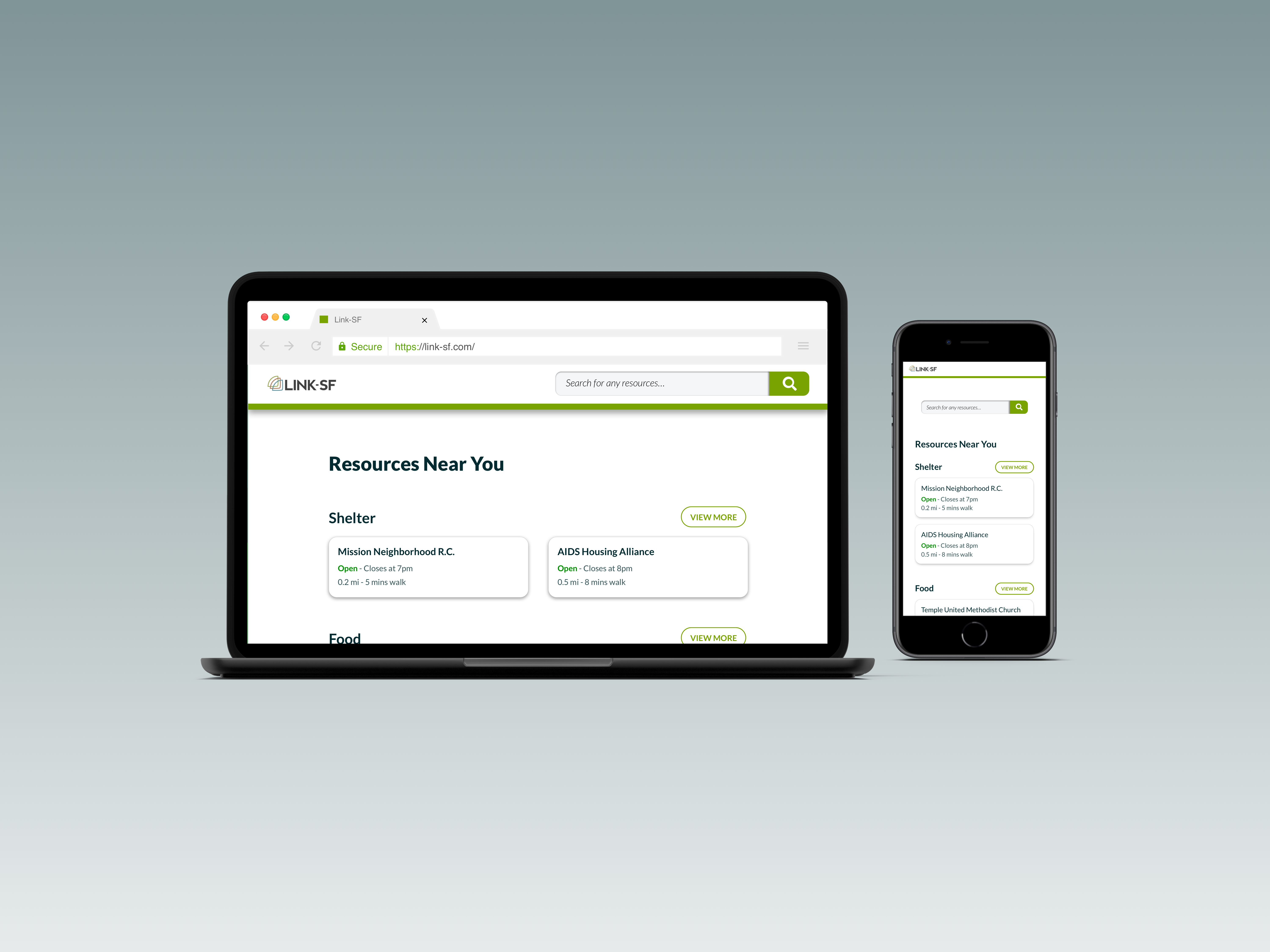
Redesigning San Francisco’s first mobile-optimized website that connects homeless and low-income residents with critical and life-saving resources nearby.
OVERVIEW
Zendesk has something called Volunteer Engineering which is a quasi-team working on Link-SF, San Francisco’s first mobile-optimized website that connects homeless and low-income
residents with critical and life-saving resources nearby. After a tech lab with user testing last week, they received a lot of user feedback with many very simple to-dos.
As a result, my friend, Emmett Ling who was working there as a Software Engineer Intern decided to commission this little app redesign project, which I took on.
DETAILS
My Role: Visual Design, Interaction Design, Product Thinking
Timeline: 2 Weeks
Tools: Sketch, Zeplin, Balsamiq
Team: Emmett Ling, Chibuzor Obiorah
Problem
For most of the users, Link-SF was either previously unknown or difficult to access. People normally used Google or Word of Mouth to access resources prior to this. Although they found it useful after they learned how to use it, there were several recurring points of friction and accessibility.
User Research
To further understand the problem, some of these frictions, and the ways that the product was not very accessible we decided to investigate, by conducting interviews.
Interviews
About 5 people were interviewed and they were males in their 30s - 50s. We did not have the chance to do talk with women or other demographics. Although this does not give us a wide range of information about all potential users, this is a fairly representative of the homeless population for the sample size.
Synthesizing Insights
After all the interviews conducted, through affinity mapping, I decided to categorize all insights into 3 categories.
Unfamiliarity
- A lot of people do not know that this resource/product exist.
- One user said “this would have been extremely helpful to me [if I had known about it] 6 months ago”
- Google or word of mouth were found to be heavily preferred because of direct and straightforward info.
Interface
- Most people don’t have the attention or interest to do filtering they just “grab” the first one.
- People wished there were more colors to the product. It is currenlty mainly black and white.
- Some people may not understand what “ordering” or “filtering” means.
- It didn't occur to some users that clicking on the organization will lead to a “details page.”
Not Enough Resources
- Some people mentioned not having enough data find where to get access to internet.
- Job Resources. “Where can I work for a day and make a few bucks?”
- Requested needle resources for heroin users - controversial but a request.
- Finding housing for Couples - another specific request.
Ideation
We started thinking of ways to tackle the problems we found. Our ideas went from improving the marketing of this product, figuring out ways to let people know about it, to adding more resources on the new design.
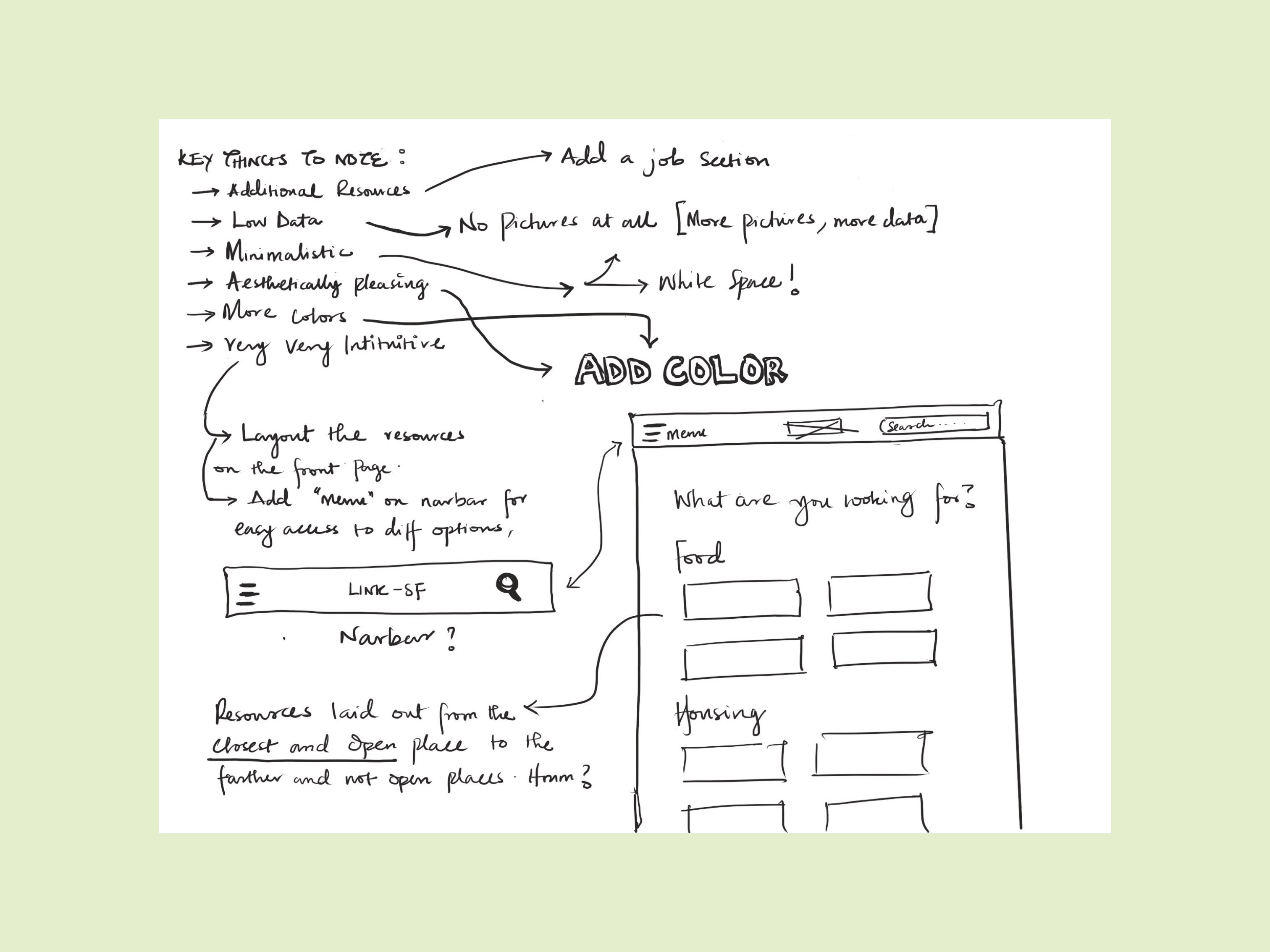
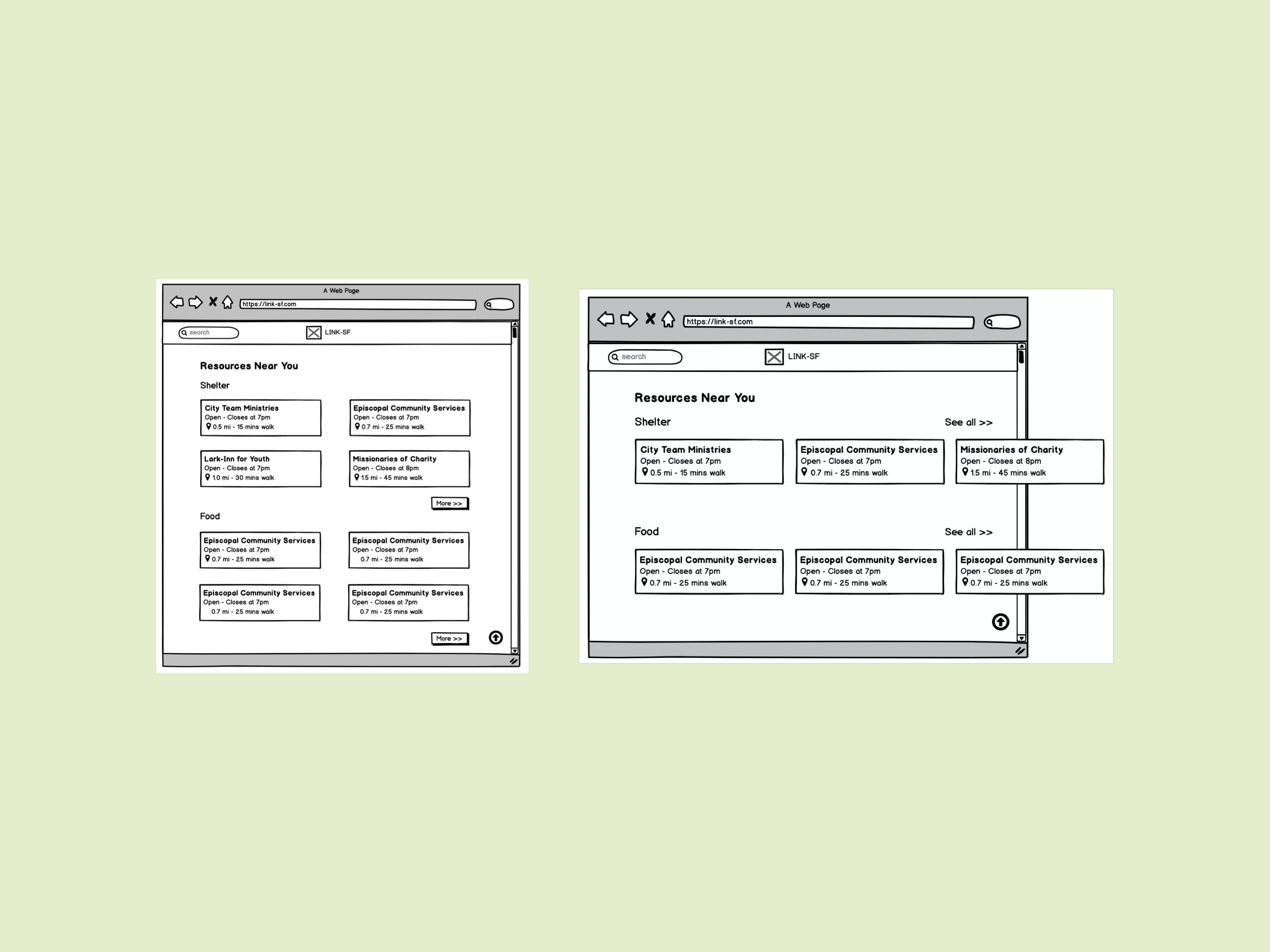
After generating ideas, keeping the HMW question and the redesign goal in mind, I started creating the information architecture. I made two different iterations for the home page using Balsamiq, two different experimenting to see the best layout for listing out the resources.
Mid-Fi Prototypes
Checking in with my team, I got some feedback based on the iterations I created. We decided to go with the second iteration because the first one contains horinzontal scrolling which might be counter-intuitive to some people, and that defeats the goal of making things easy to navigate. We decided to keep it as simple as possible. I moved on to Sketch and starting making the wire-frames.
Design Guidelines
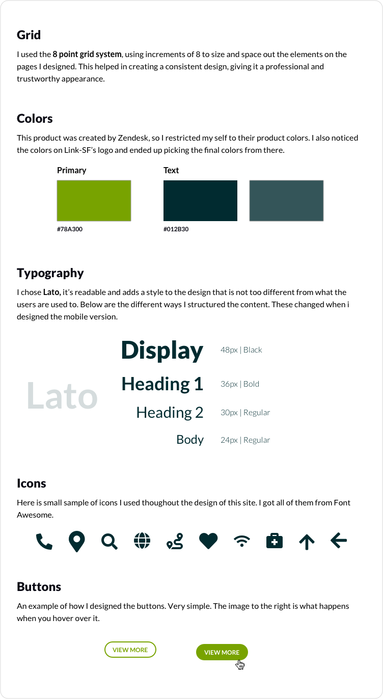
The current design doesn’t have any existing design guideline established. It did not have any set color, or components and since I was adding most of these things and creating an entirely new designwith new features, I decided to create a Design Guideline, that’ll help me along the way. It’s a product created by Zendesk so I tried to still show that by using some of Zendesk’s brand color.
High-Fidelity
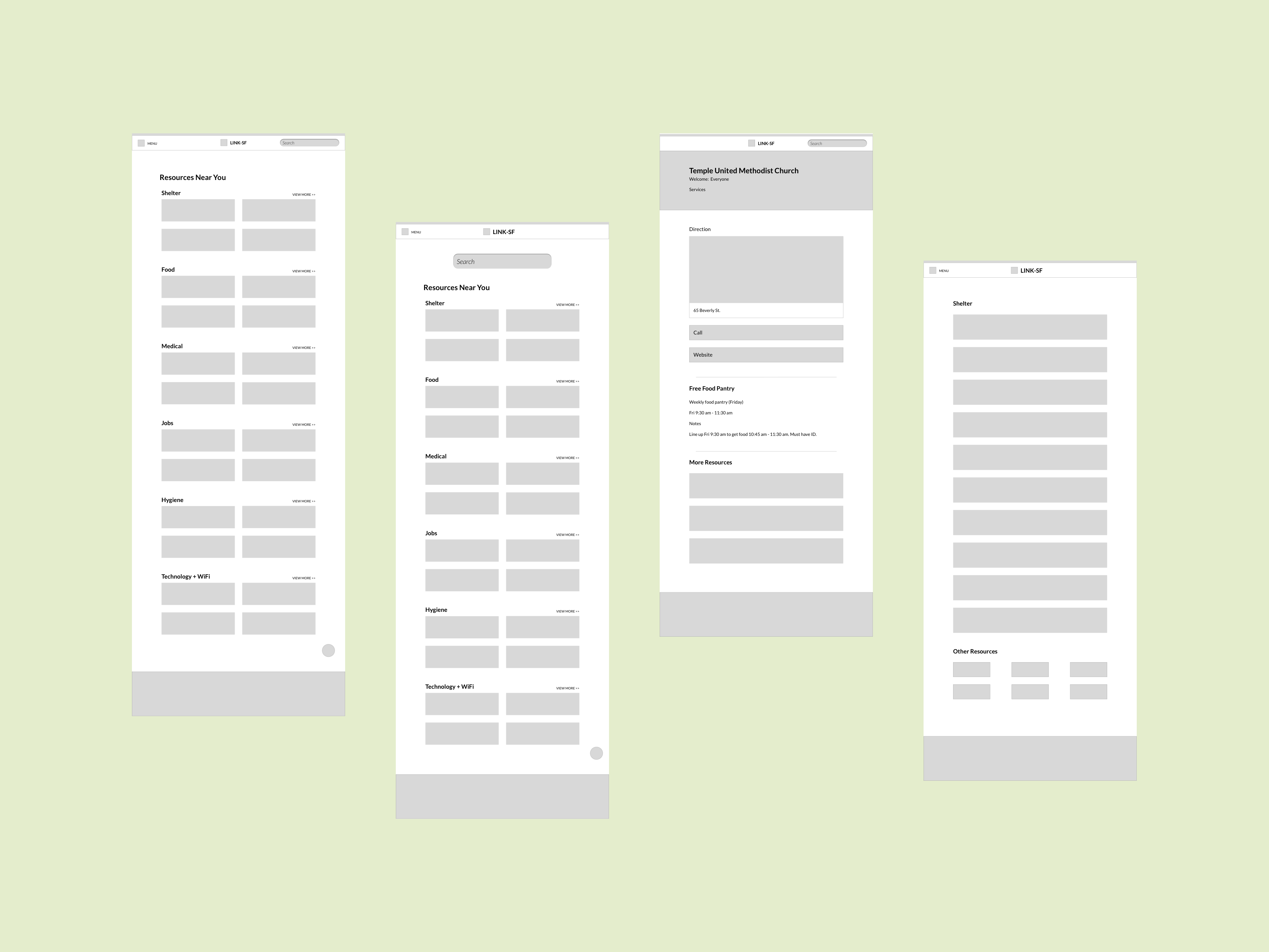
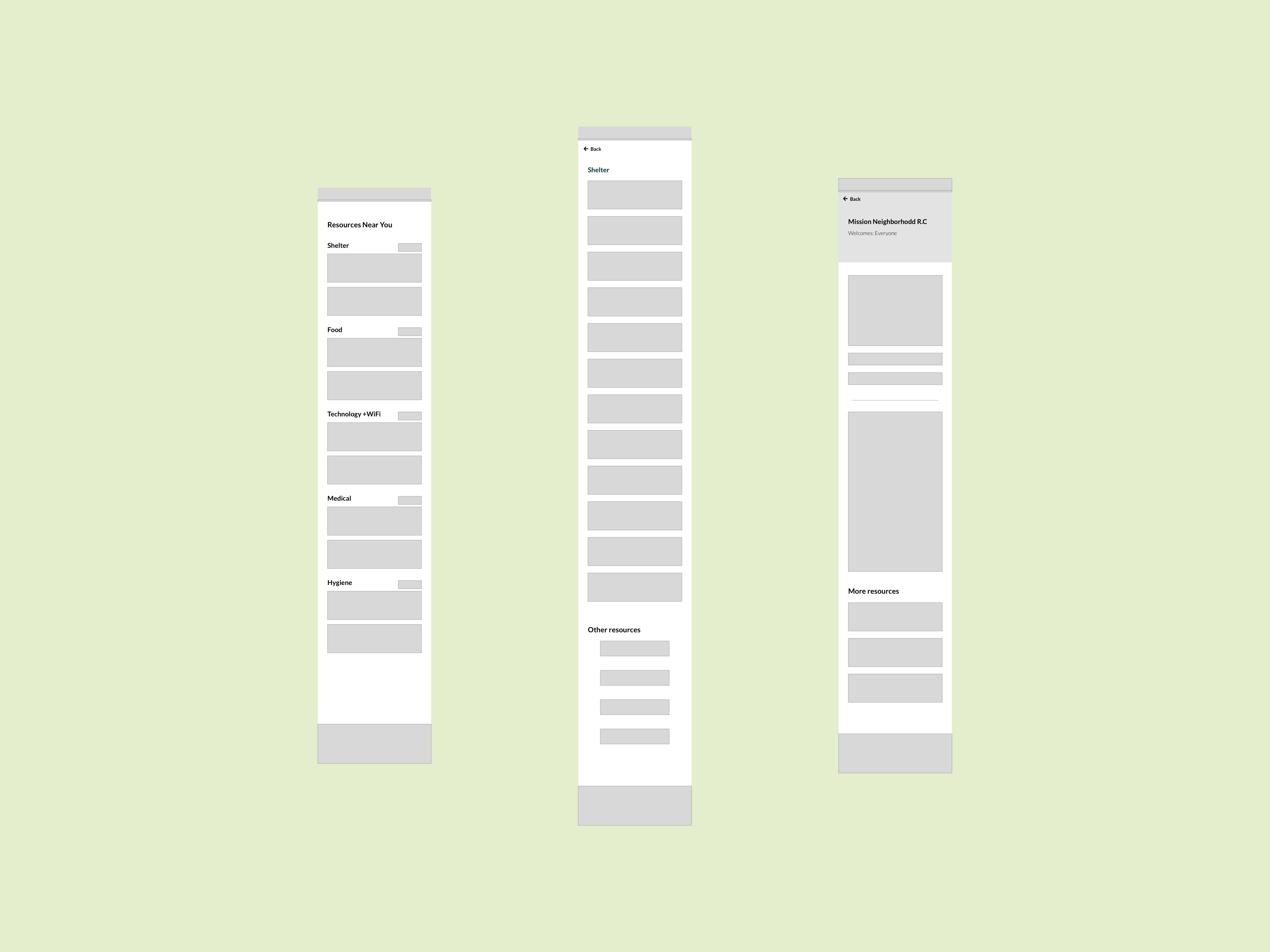
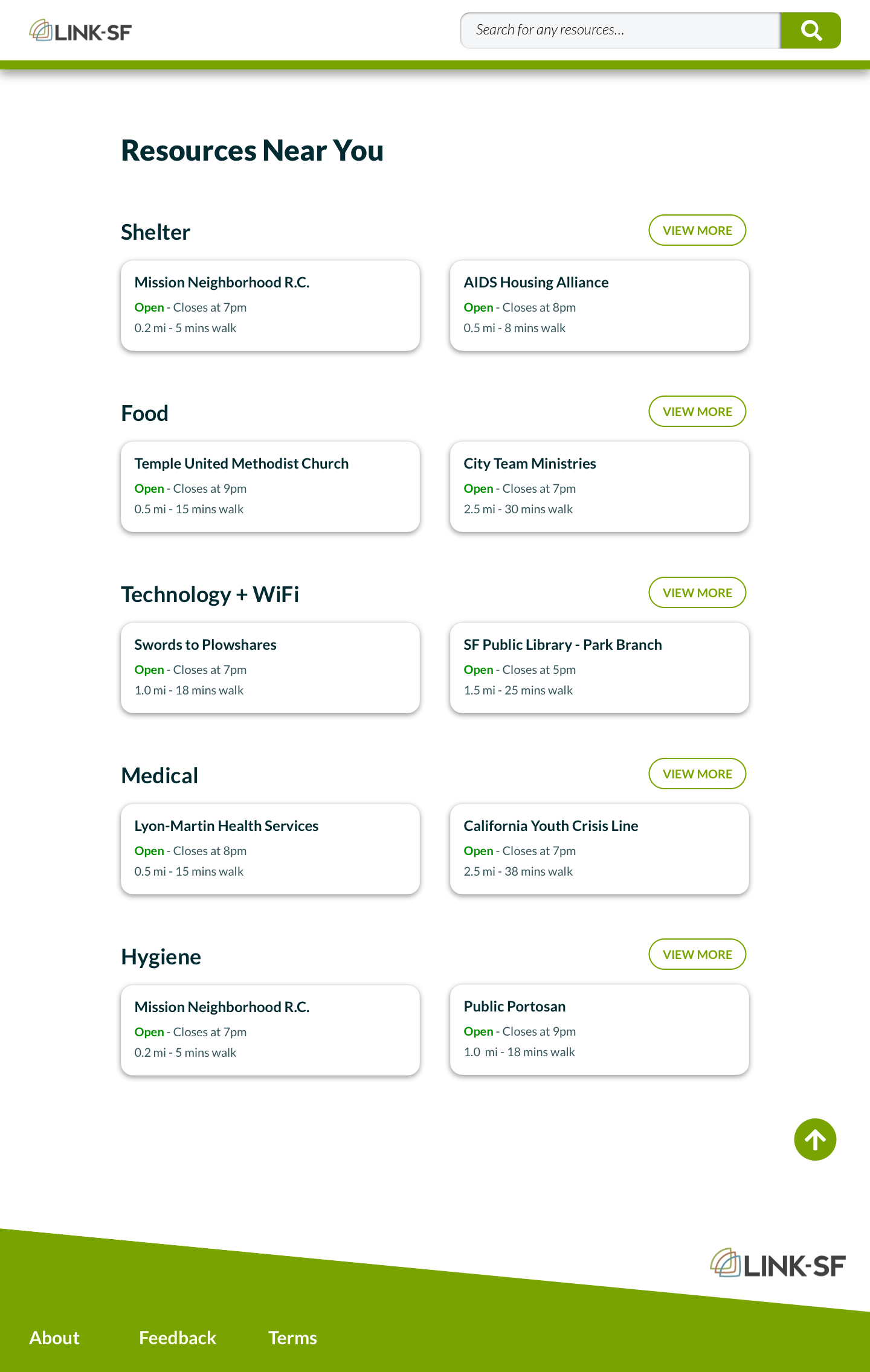
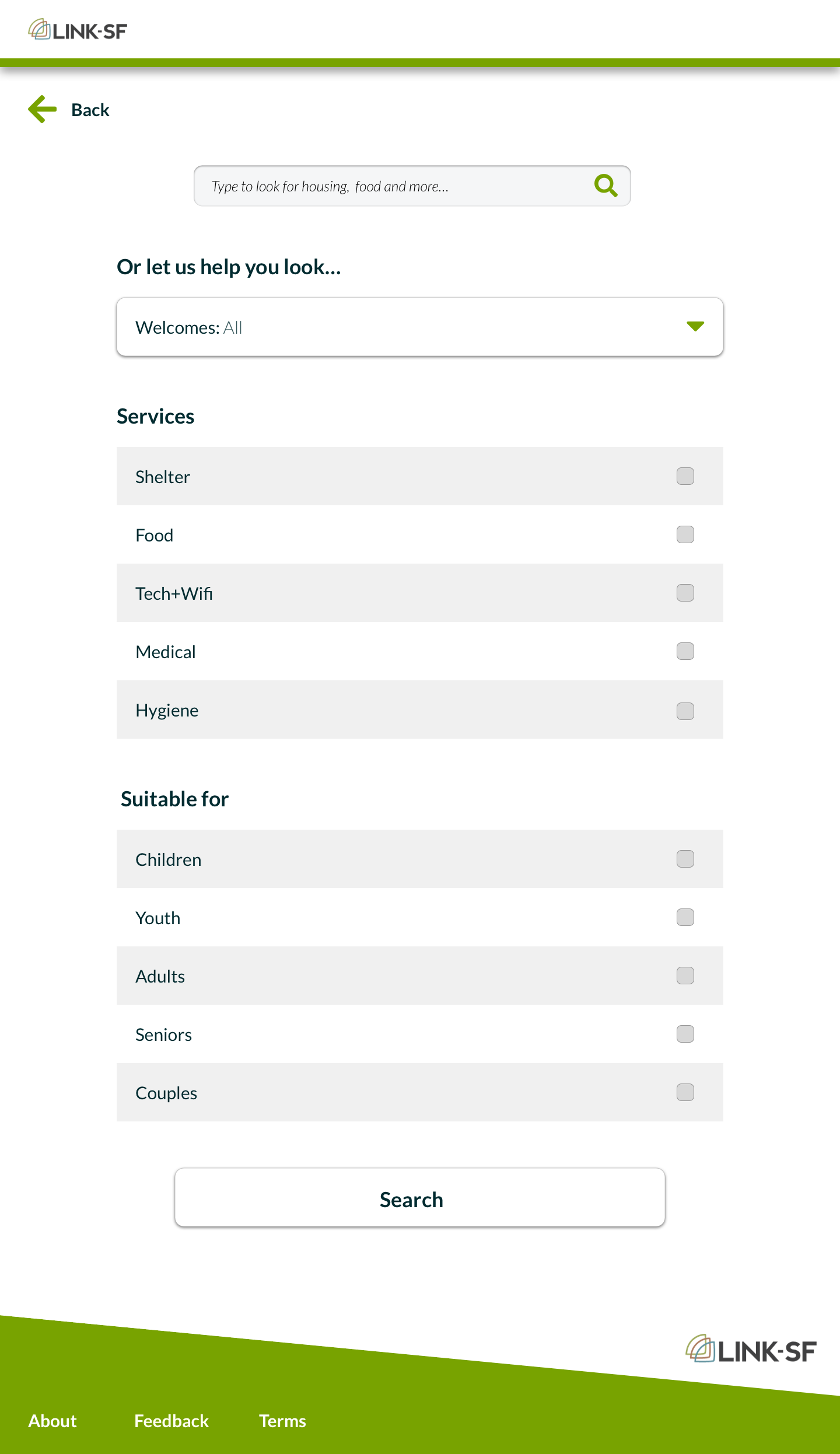
Again, with the aim of making the navigation as simple as possible, we removed the menu button at the upper left corner. It wasn't necessary since everything was laid out on the user Interface. I made two iterations where the search bar was located at different places. I decided to have it in the Nav bar because it will be fixed which will make it readily available for the user.


Moving Forward
Working on this project, I realized the potential it has. If more people find out about it, i'm sure it'll be helpful and it could expand beyond San Francisco. I wish I had more time to re-iterate and user test my design but I had to hand off my new design back to Zendesk, where I hope they continue to improve on it.
Reflections
1. I was working with two developers on this project and it forced me to be very careful with my craft.
They asked me for specifications which meant I needed to make sure I knew the amount of spacing I was using
on each section and so much more. It showed me the importance of honing in on my craft, always making sure my design
is clear and concise.
2. This project also showed me the importance of being organized, especially when working with a team. I had to be organized throughout
this project. I had to make sure I was keeping track of my design decisions and every component I used. I had to
make sure that I documented all the assets I used, from the color to the typogragphy. I also made sure to keep all the
files used for this project because I handed it off to other people to work on it too.
