ThredUP
Conducted research and designed a new checkout experience for ThredUP's mobile app users, with a goal to make it seamless and to increase conversion rate.
OVERVIEW
The world's largest fashion resale marketplace, ThredUP, is a fashion e-commerce platform focused on secondhand clothing.
As a product design intern, I got to work with the product team, focusing on their native app.
I worked on three different projects, and got to help the team out in different ways, but my main project was improving
the checkout experience on the native mobile app, which is what this case study is about.
DETAILS
My Role: Product Thinking, Research, Visual Design, Prototyping, and Interaction Design.
I did everything from the research all the way to the prototyping the final designs.
Timeline: 8 Weeks
Tools: Figma
Team: Chibuzor Obiorah, Sarah Olson (Mentor), Jenna Rosenthal (PM Intern)
Problem
On the thredUp native app, there was a 68% drop-off rate from the cart page to the checkout page, and even a 20% more drop-off rate
from the checkout page to users placing an order.
Since the checkout funnel is an important part of the thredUp business, we wanted to see if we could reduce the drop-off rate.
Research
To tackle this problem, I conducted some secondary research, reading through a bunch of articles to understand what makes a good checkout experience, and what made it stand out. One of the things that stood out right to me was:
69.23% of all e-commerce visitors abandon their shopping carts
So I started to dig deeper to find some of the reasons why people abandoned their carts. Thankfully, some of these existing research was very impactful in the new designs I created.
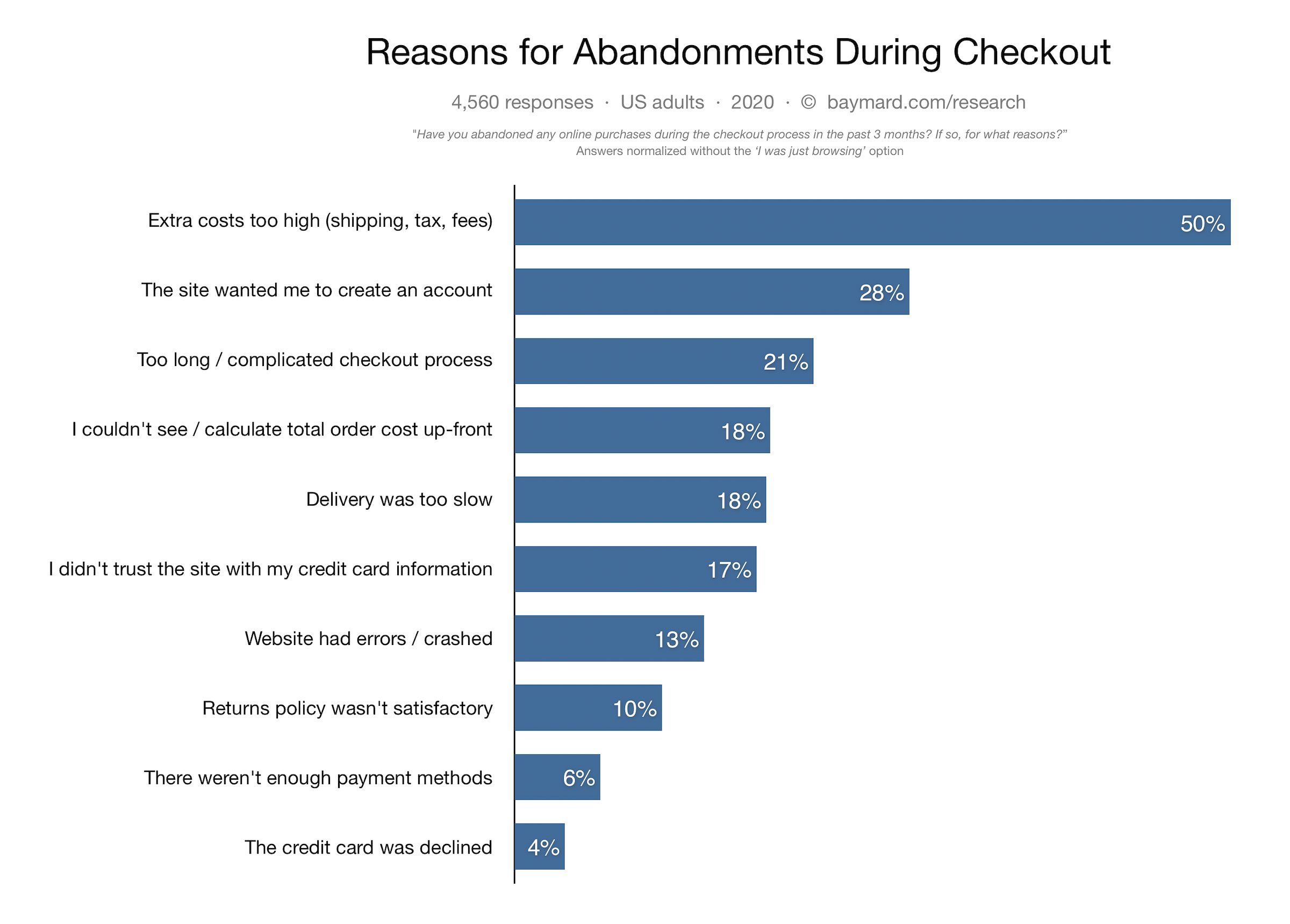
Some Insights
There were a lot of insights and lessons about designing an awesome checkout experience with examples in mind, but I narrowed them down to things that related more with the thredUP's native app. Here are my top takeaways:
People want to see the checkout flow, the steps, progress, and different leaps involved, way ahead of time.
A Good Checkout flow is transparent, showing all things users need to know, like the extra cost.
Reducing any frustrations, making it simple, and intuitive reduces friction and helps users go through the checkout flow quicker.
Providing users with options, and helping them through out the checkout flow, propels them faster to the end-goal.
Competitive Analysis
In order to construct a concise and solid foundation for ThredUP's checkout flow, I ventured to see out to see what the other e-commerce platforms were doing well in their checkout process.
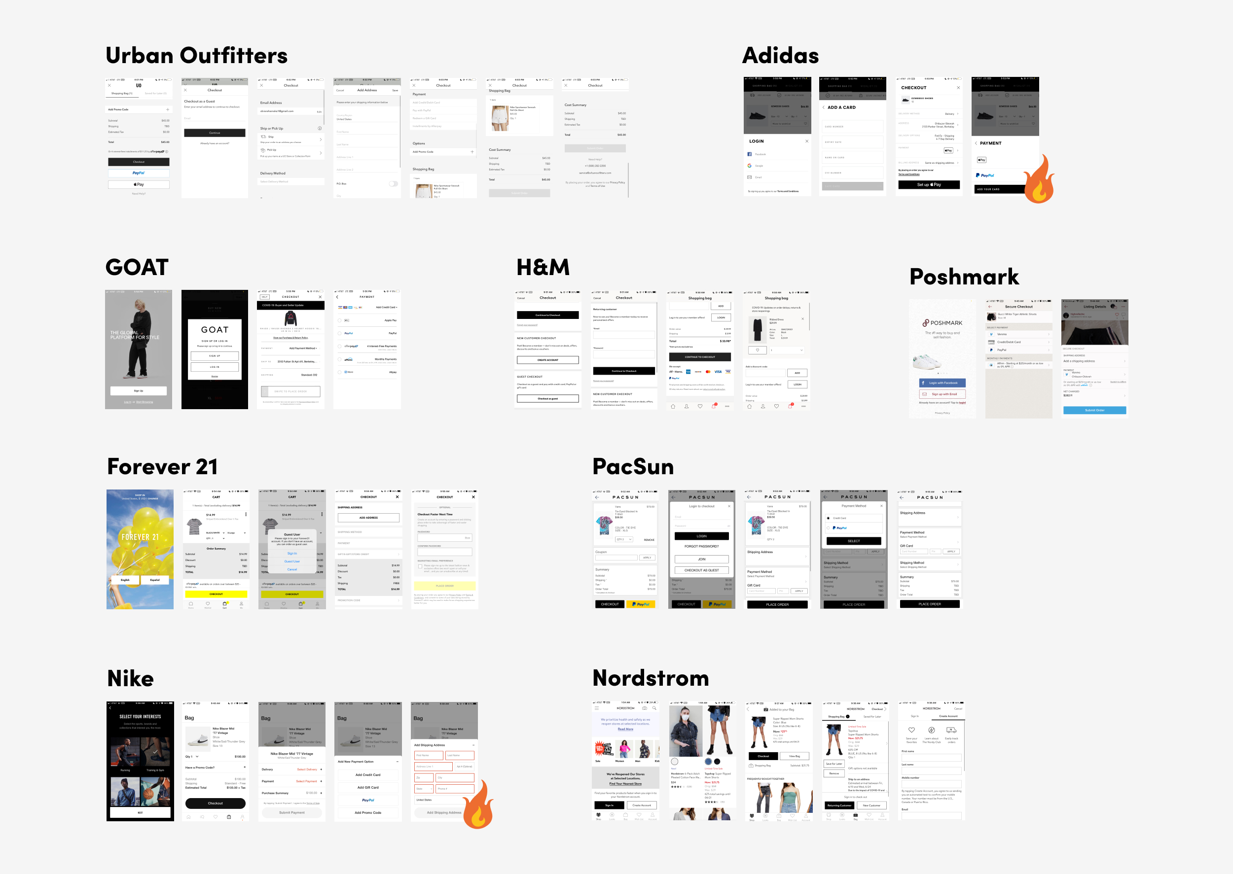
I evaluated several features and things they offered their users like guest checkout, the order in which they placed the steps involved, how they handled payment methods, how transparent they were e.t.c.
Bringing Everything To Life
After research, I brainstormed ideas to improve the checkout experience, including new features like the ability to scan credit card, offering guest checkout,
inline validation for credit cards, e.t.c.
Taking into some business considerations and technical limitations, I moved on to bringing some of these ideas to life.
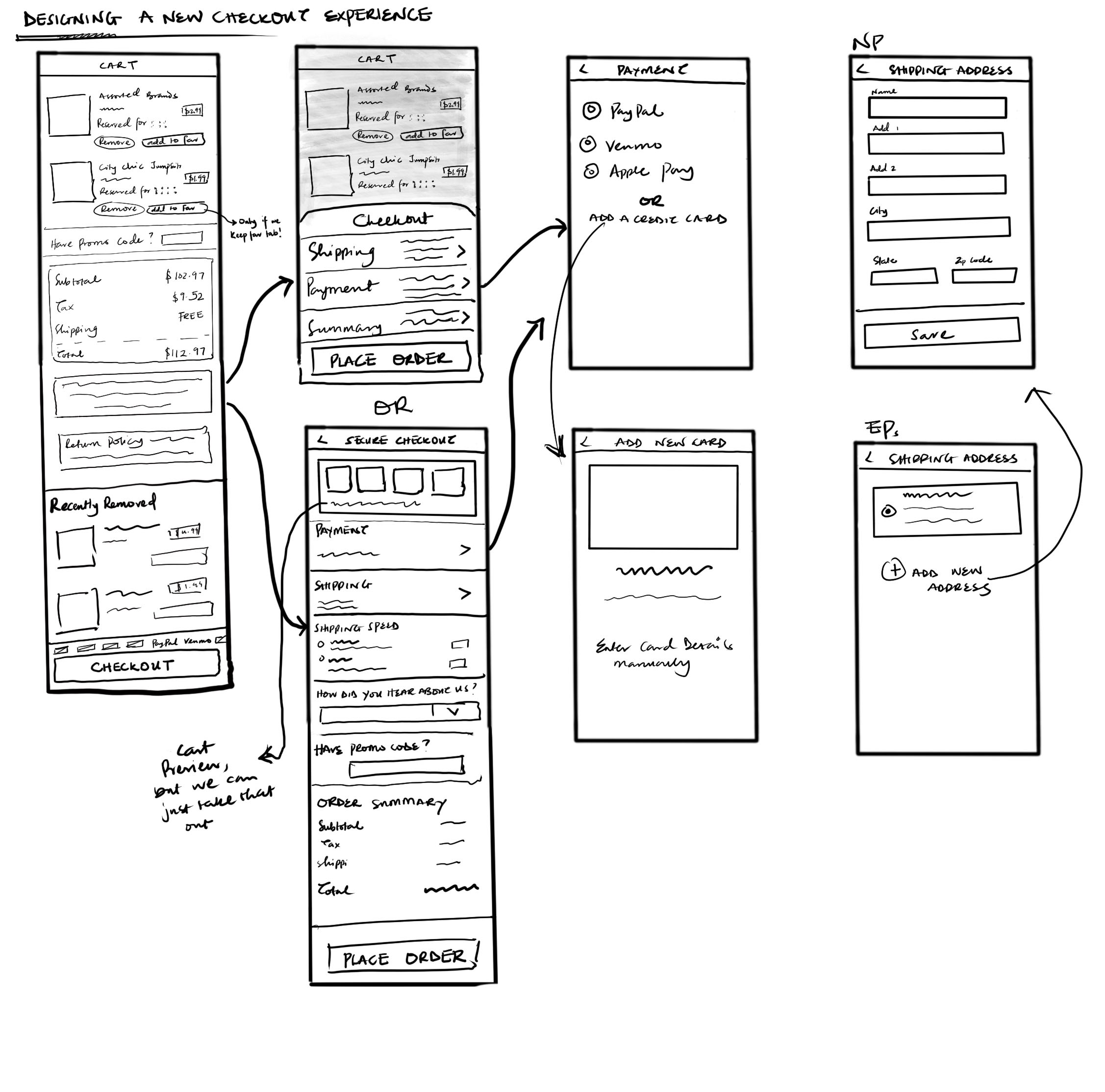
Lo-Fi Sketching
Before moving on, I wanted to get a feel for what the new checkout flow could be. I was exploring between having all the steps displayed in one page and the steps laid out on a half-sheet.
Iterating Through Feedback
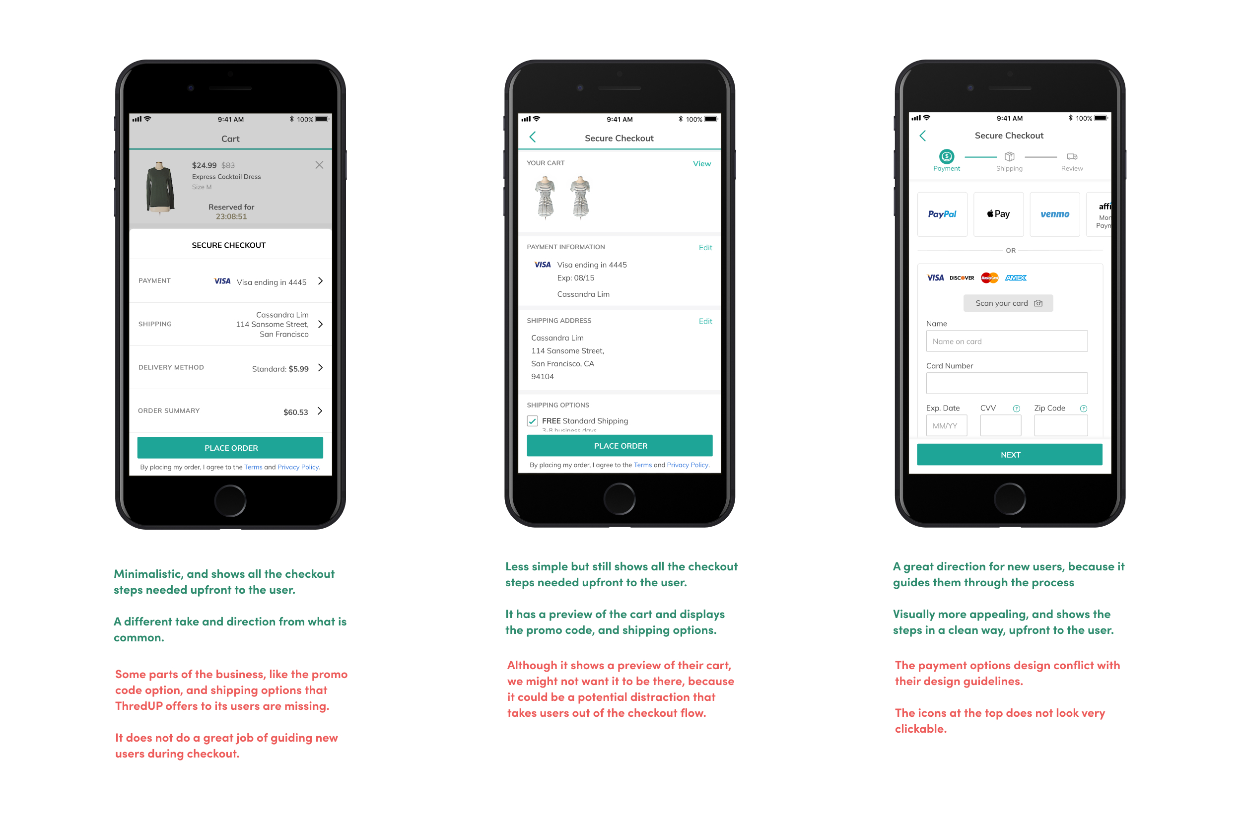
When I started working on the High-Fidelity mockups for this designs, I created three different iterations highlighting how I wanted the new checkout flow to be. One of the major feedback I received was to think about users that had never purchased items at thredUP and users who had purchased before and how their experience might be different. We realized that the half-sheet does not do a good job of directing new users, and the third one had a nice step by step direction for new users
Adapting To Changes
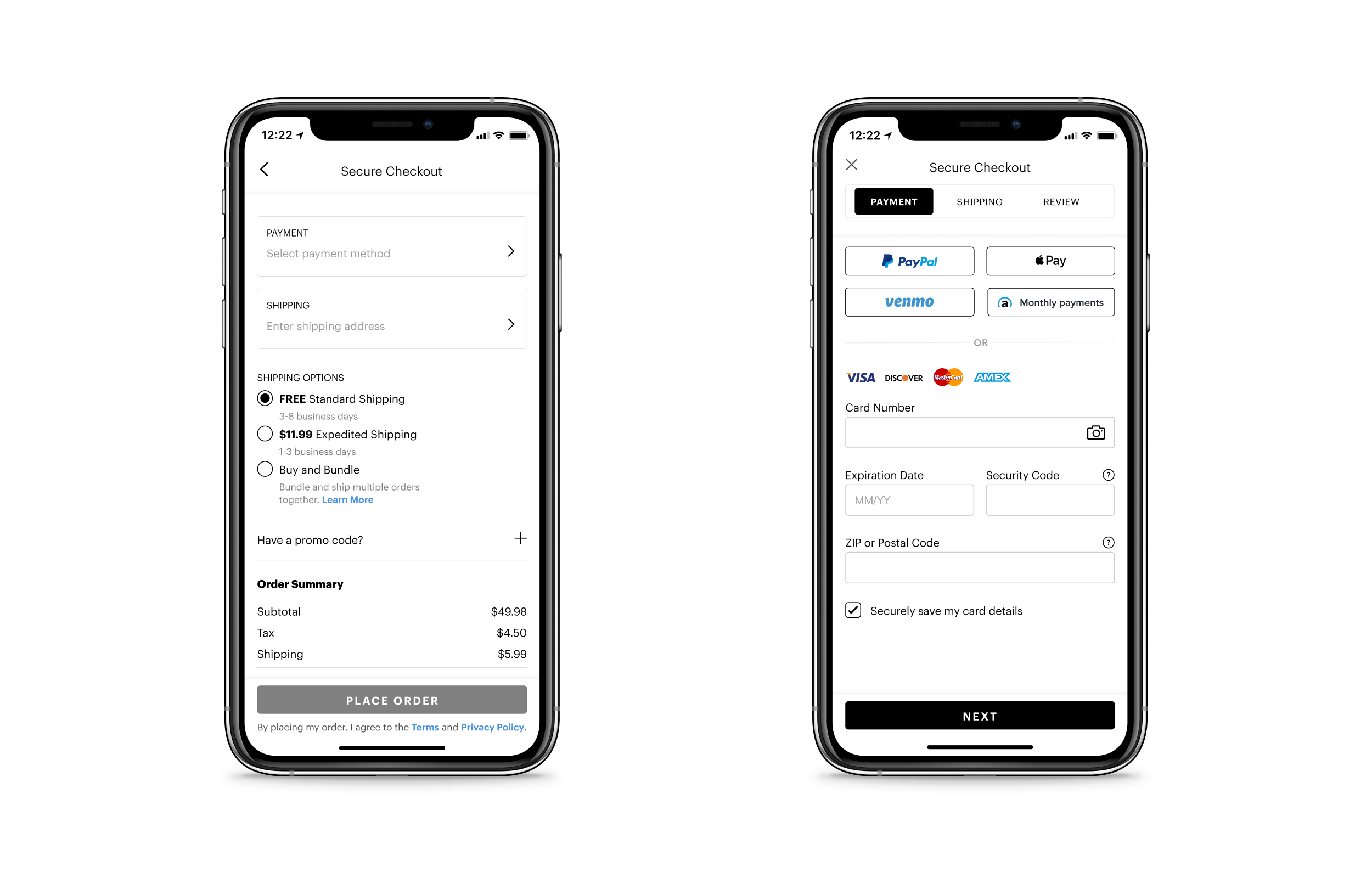
While working on this project, ThredUP was going through a rebrand process, so I moved on to the new rebrand design system, addressing the feedback I received, adding to the design I created, and ended up with two final iterations.
Thinking Through Interactions
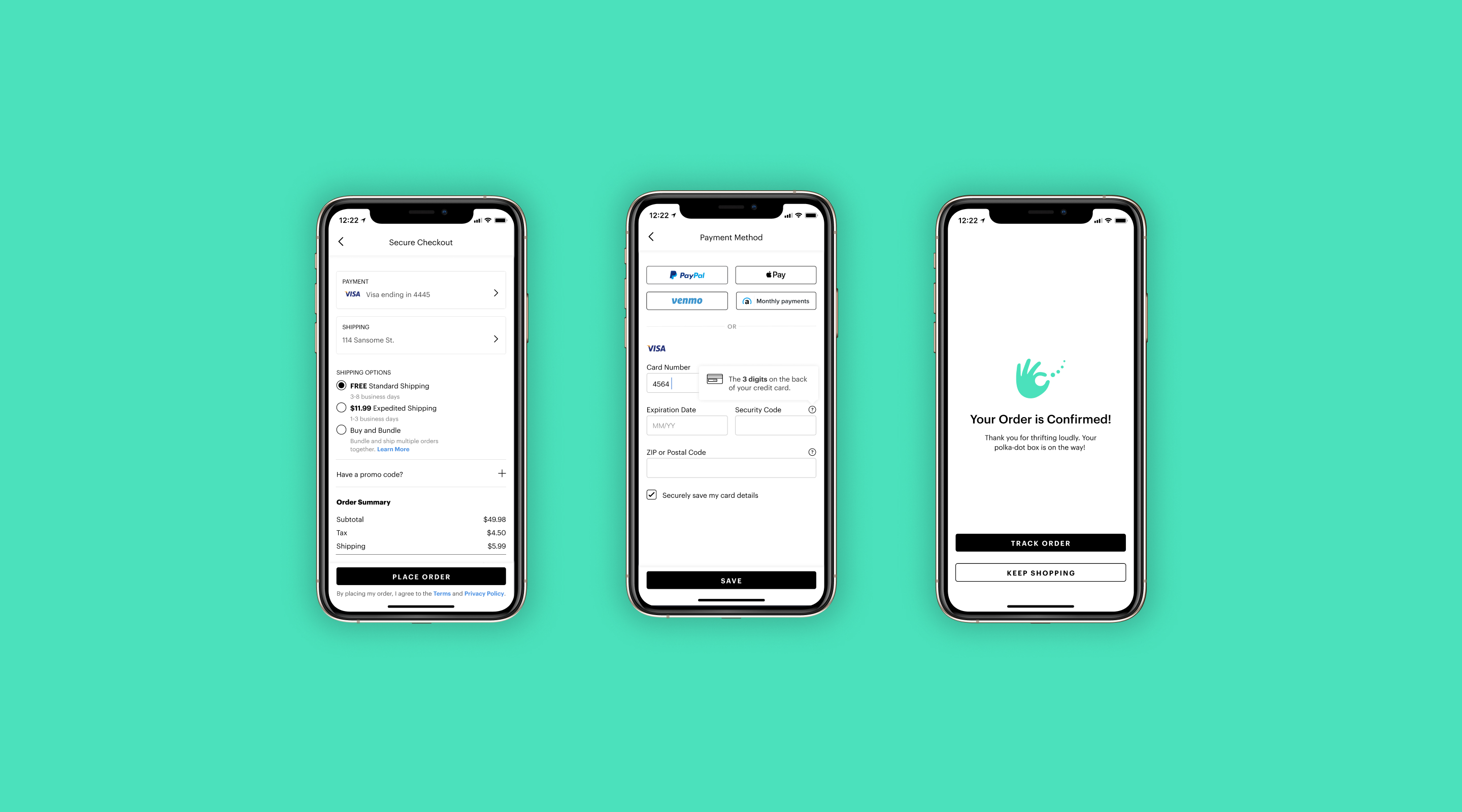
To make the Checkout flow accomplish our goal I had to think through all the interactions going on in the checkout flow, from inline validations to what happens when they click the buttons. I made a prototype to visualize show all the interactions.
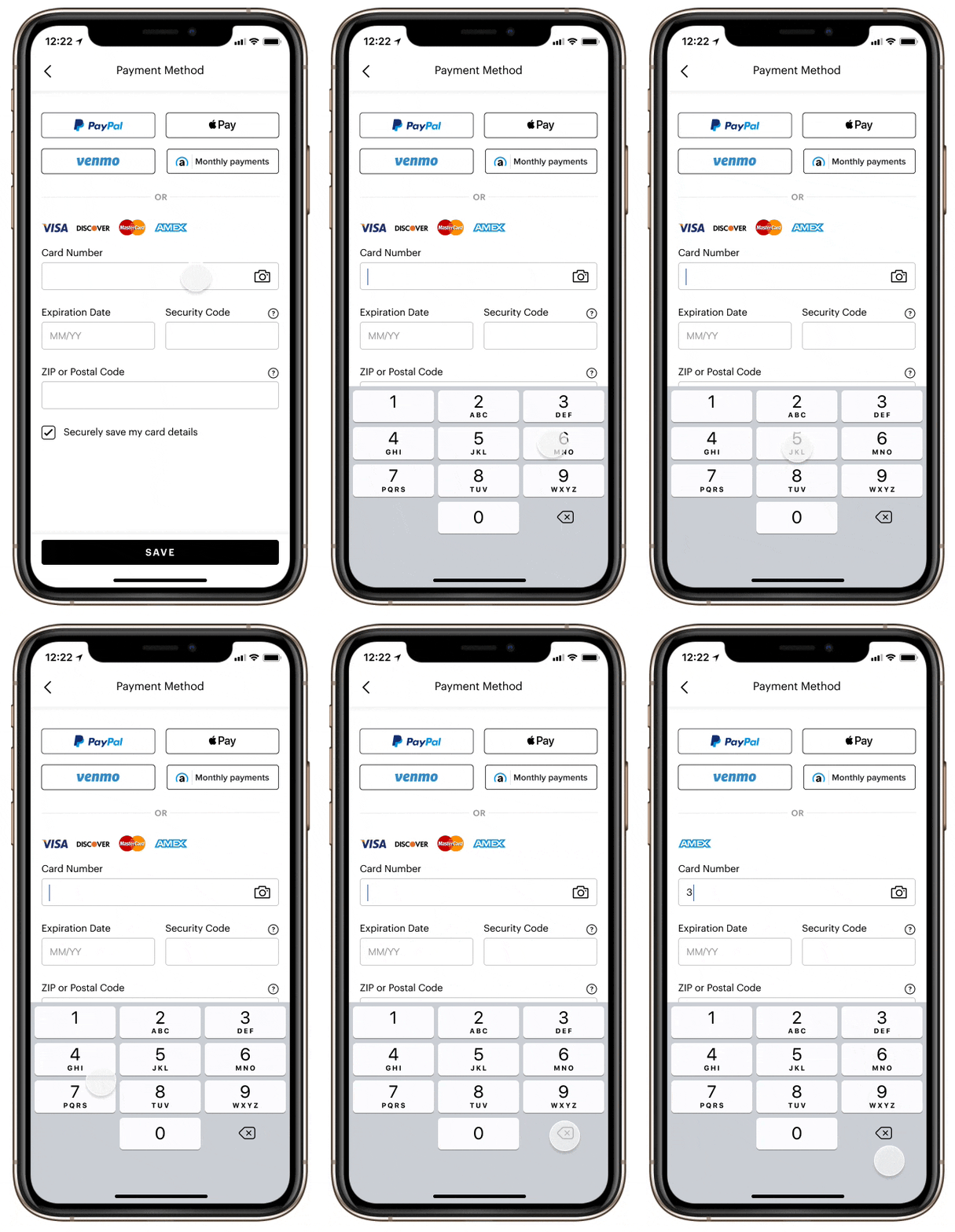
Credit card inline validation
I added a feature where the app tells users what kind of card they are inputing right when they type the first number.
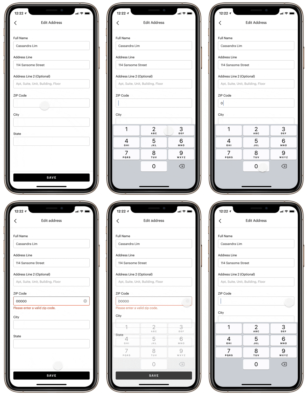
Handling errors on the go
Users will be able to know when they make a mistake while filling their information instead of waiting till the end, and having to everything all over again.
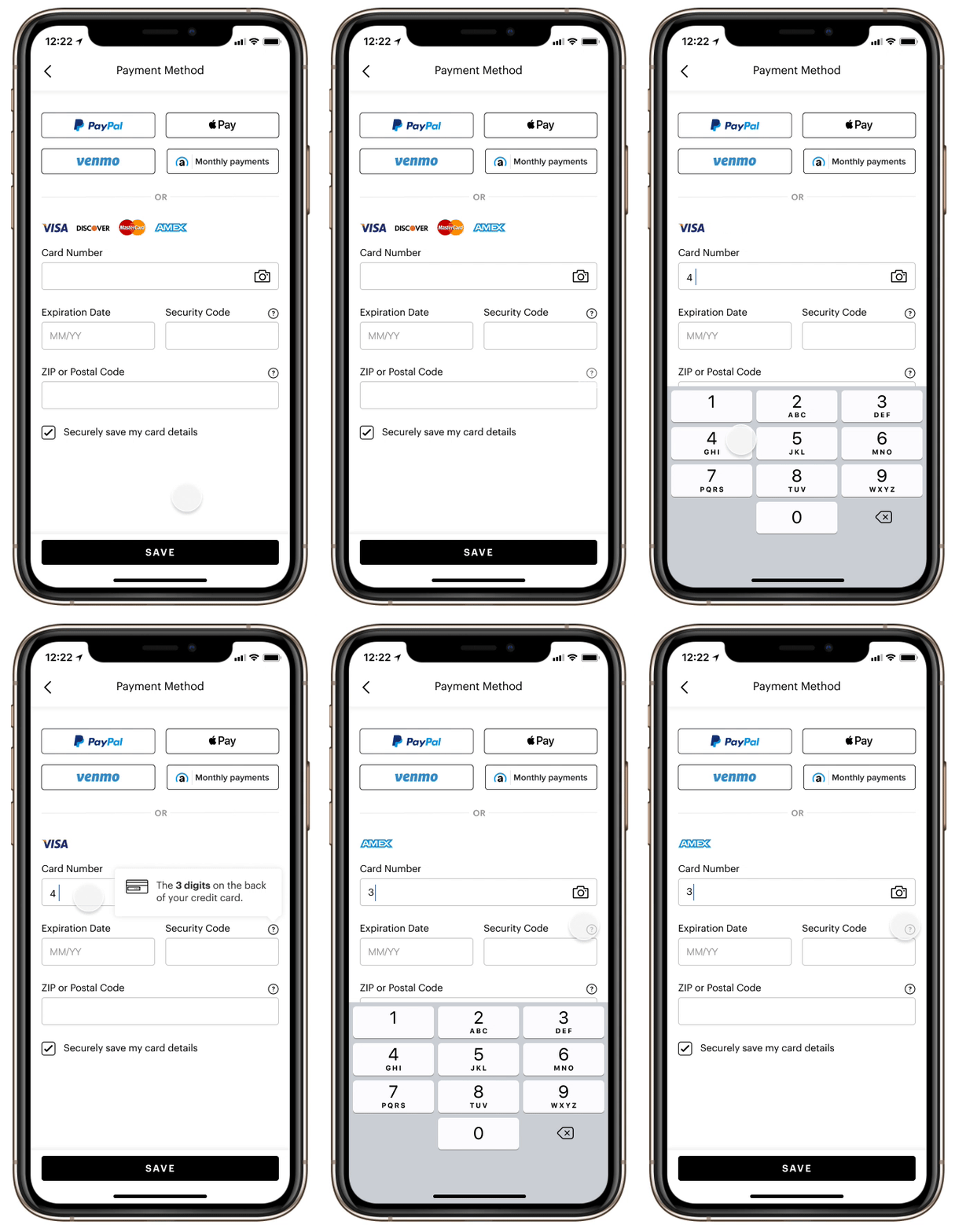
Tooltips
Redesigned the tooltips to give users better information of what is required of them as they are filling out the forms.
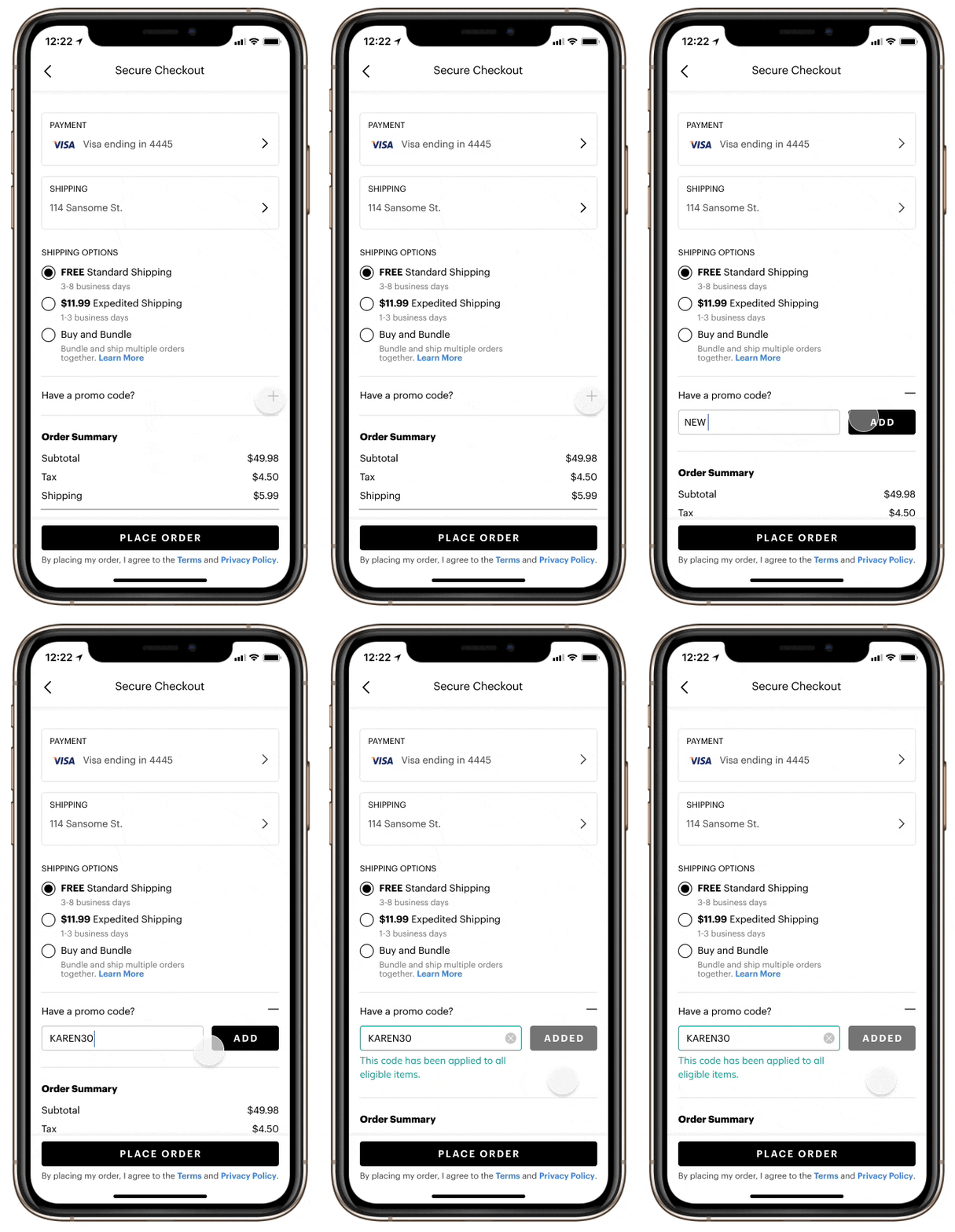
Highlighting promo code
Prior to this, the promo code was hidden. It is a major part of the business and gives people incentive to purchase items so I made more emphasis on this better than how it was before.
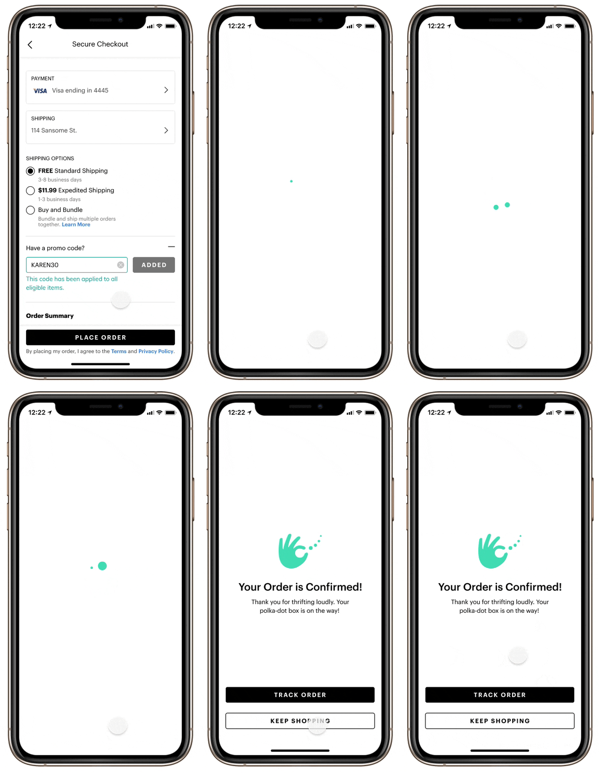
Order confirmation page
I found a great oppurtunity here to add elements of the rebrand, giving users an exciting confirmation notice when they place their order and gives them option to keep navigating through the app.
Moving Forward
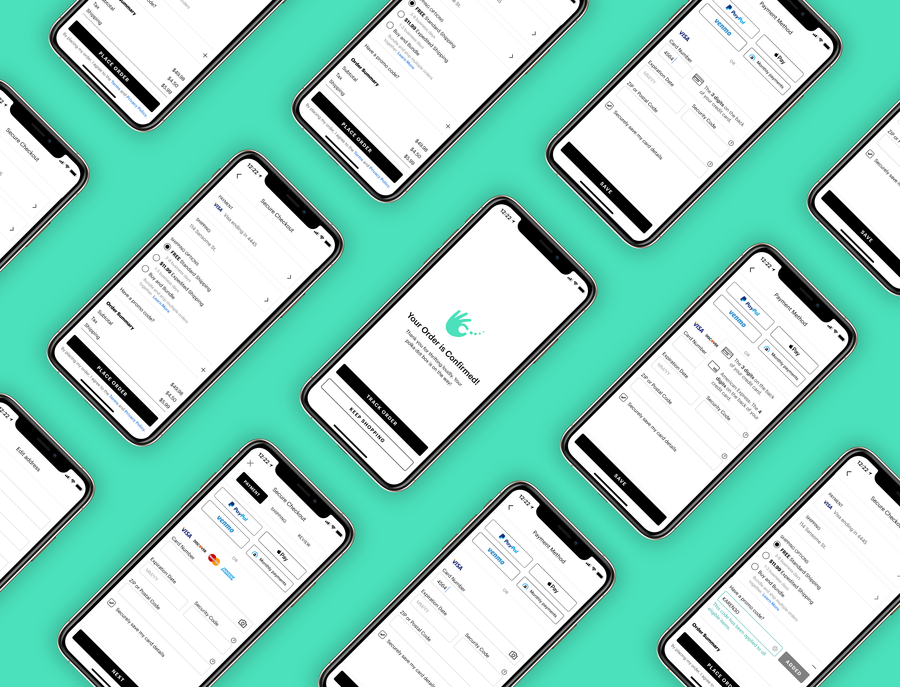
Working on this project was very sepcial because of how impactful it is and also all that was involved in getting to the final solution, the research, design systems, and the rebrand. I finished right when my internship ended so I turned in all my work. I created two versions which will be tested by the team before implementing it on ThredUP's mobile app.
Reflections
Design needs to co-operate with business
One of the biggest challenges I faced was working on the payment method because of all the things I had to consider which includes some business
considerations from ThredUP and the companies from the payment methods. I had to make a design that satisfied all of the guidelines.
It was challenging but I was able to come to a final solution satisfying all the constraints.
Data empowers design
This project came about because of the data showing what was going on in the checkout flow. We always want
to create impactful products and at first glance it's hard to come to a conclusion on what needs to improved or changed, but looking at data
helps us. They aren't just numbers, they inform us on how our users use our product. I wish I had more time to test the designs
I created, but it's on ThredUP's roadmap and they will be testing it out before rolling the designs to the public.
